---
title: "FGCZ tabset layout example"
format:
fgczQuartoTemplate-html:
include-after-body: _extensions/fgczQuartoTemplate/fgcz-plot-finder.html
fgcz-buttons: [search, download, source]
vignette: >
%\VignetteIndexEntry{Example FGCZ tabset report}
%\VignetteEngine{quarto::format}
%\VignetteEncoding{UTF-8}
---
```{r setup}
#| include: false
library(ggplot2)
library(DT)
library(plotly)
generated_at <- format(Sys.time(), "%Y-%m-%d %H:%M:%S %Z")
report_package_version <- as.character(
utils::packageVersion("fgczQuartoTemplate")
)
```
::: {.panel-tabset}
# Overview
This worked example shows how an FGCZ analysis report turns compact input data
into searchable tables and figures, then packages the results in a navigable,
self-contained HTML report. Replace the illustrative content with the purpose,
inputs, and analysis goal of the report you are authoring.
::::: {.fig-row}
:::: {.fig-main}
```{r overview-visual-abstract}
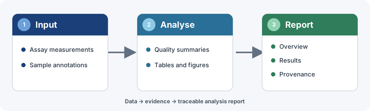
#| fig-cap: >-
#| Visual abstract of the FGCZ reporting workflow. Compact assay inputs feed
#| an analysis that produces quality summaries, tables, and figures, which
#| are organized into a searchable report with explicit provenance.
#| fig-alt: >-
#| Three connected cards labelled Input, Analyse, and Report. The Input card
#| lists assay data and sample annotations, Analyse lists quality summaries,
#| tables, and figures, and Report lists overview, results, and provenance.
#| out-width: "100%"
if (!file.exists("fgcz-report-overview.svg")) {
file.copy(system.file("quarto/fgcz-report-overview.svg", package = "fgczQuartoTemplate"), ".")
}
knitr::include_graphics("fgcz-report-overview.svg")
```
::::
:::: {.fig-side}
## At a glance
```{r overview-summary}
knitr::kable(
data.frame(
Summary = c("Input", "Scale", "Outputs", "Goal"),
Value = c(
"Built-in iris and mtcars data",
paste(nrow(iris), "flowers and", nrow(mtcars), "cars"),
"Tables, static and interactive figures, and nested tabs",
"A compact, searchable, self-contained analysis report"
),
check.names = FALSE
),
caption = "High-level summary of the example report."
)
```
::::
:::::
# Section callout
<!-- PATTERN 1 — section-level callout: a full-width note that frames or
caveats the WHOLE sub-tab (methods summary, data source, scope). Just a
plain ::: callout (3 colons), no columns. -->
::: {.callout-note}
## About this section
Use a full-width callout when the note applies to *everything* in the sub-tab
rather than one figure. Swap `note` for `tip` / `warning` / `important` to
change the colour and icon; add `collapse="true"` to fold it shut by default.
:::
Main content of the tab then runs full-width underneath.
```{r first-dt-table}
DT::datatable(
head(iris, 10),
caption = paste(
"First ten rows of iris flower measurements, including sepal length,",
"sepal width, petal length, petal width, and species."
),
filter = "bottom",
extensions = "Buttons",
rownames = FALSE,
class = "compact stripe",
options = list(
pageLength = 5,
scrollX = TRUE,
dom = "Blfrtip",
buttons = c("csv", "excel")
)
)
```
# Annotated figure
<!-- PATTERN 2 — OPTIONAL plot + side callout (flush, same height).
RULE: every figure carries a native #| fig-cap caption (below the plot) —
that alone is the default figure style and obeys the yaml out.width (see
the Nested tab for a plain example).
EXTRA (opt-in): a green callout beside the plot for annotation, stretched
to the plot's height via .fig-row in fgcz.scss. In THIS side-by-side
layout the plot fills its column (size set by .fig-main in fgcz.scss, not
out.width). Keep numbers as inline R so the note can't drift from the
figure. The callout keeps its natural height so collapse="true" works
(it is NOT locked to the plot height); on narrow screens it drops below
the plot. Fence colons nest: 5 = .fig-row · 4 = each side · 3 = .callout. -->
```{r second-demo}
#| include: false
demo_df <- mtcars
demo_n <- nrow(demo_df)
demo_mean <- round(mean(demo_df$mpg), 1)
demo_plot <- ggplot(demo_df, aes(wt, mpg)) +
geom_point(size = 2) +
labs(x = "Weight (1000 lbs)", y = "Fuel economy (mpg)") +
theme_bw()
```
::::: {.fig-row}
:::: {.fig-main}
```{r second-plot}
#| fig-cap: >-
#| Fuel economy as a function of vehicle weight in mtcars. Each point is one
#| car; the x-axis shows weight in 1000 lbs and the y-axis shows miles per
#| gallon.
demo_plot
```
::::
:::: {.fig-side}
::: {.callout-tip collapse="true"}
## What this shows
Each point is one of the **`r demo_n`** cars; mean fuel economy is
**`r demo_mean` mpg**, and heavier cars are clearly less efficient. This green
box is an optional annotation beside the plot — the figure's own caption sits
underneath as usual.
:::
::::
:::::
# Nested
<!-- PATTERN 3 — nested tabset (card-in-card). The inner ::: {.panel-tabset}
uses ## sub-headings for its tabs, one level deeper than the # tabs of
the outer set. With fgcz.scss the inner set renders as a card inside the
outer card. Chunks call existing functions only — no template-local
helper defs (DT::datatable for the table, ggplot2 for the figure). -->
::: {.panel-tabset}
## Table
```{r nested-table}
DT::datatable(
head(mtcars[, 1:6], 8),
caption = paste(
"First eight rows of mtcars vehicle measurements, including fuel economy,",
"cylinders, displacement, horsepower, rear axle ratio, and weight."
),
filter = "bottom",
extensions = "Buttons",
rownames = FALSE,
class = "compact stripe",
options = list(
pageLength = 5,
scrollX = TRUE,
dom = "Blfrtip",
buttons = c("csv", "excel")
)
)
```
## Figure
```{r nested-figure}
#| fig-cap: >-
#| Fuel economy by cylinder count in mtcars. Boxplots summarize miles per
#| gallon for cars grouped by number of cylinders.
ggplot(mtcars, aes(factor(cyl), mpg, fill = factor(cyl))) +
geom_boxplot(show.legend = FALSE) +
labs(x = "Cylinders", y = "Fuel economy (mpg)") +
theme_bw()
```
:::
# Three-level
<!-- PATTERN 4 — three levels of nesting (tabset → tabset → tabset). Every
depth renders as the IDENTICAL folder-tab card (no per-level colour; see
fgcz.scss) — depth reads from the nested card borders alone.
Fence colons step DOWN per level so nesting is unambiguous:
4 colons = level-2 tabset · 3 colons = each level-3 tabset. Tabs at each
level are just headings: ## for level 2, ### for level 3. -->
:::: {.panel-tabset}
## By dimension
::: {.panel-tabset}
### Sepal
```{r tl-sepal}
#| fig-cap: >-
#| Sepal width as a function of sepal length in iris. Each point is one
#| flower; colour encodes species and both axes are measured in centimetres.
ggplot(iris, aes(Sepal.Length, Sepal.Width, colour = Species)) +
geom_point(size = 2) +
labs(x = "Sepal length (cm)", y = "Sepal width (cm)", colour = "Species") +
theme_bw()
```
### Petal
```{r tl-petal}
#| fig-cap: >-
#| Petal width as a function of petal length in iris. Each point is one
#| flower; colour encodes species and both axes are measured in centimetres.
ggplot(iris, aes(Petal.Length, Petal.Width, colour = Species)) +
geom_point(size = 2) +
labs(x = "Petal length (cm)", y = "Petal width (cm)", colour = "Species") +
theme_bw()
```
:::
## Distributions
::: {.panel-tabset}
### Sepal length
```{r tl-sepal-hist}
#| fig-cap: >-
#| Distribution of sepal length by iris species. Overlaid histograms show
#| flower counts across 20 sepal-length bins in centimetres.
ggplot(iris, aes(Sepal.Length, fill = Species)) +
geom_histogram(bins = 20, alpha = 0.7, position = "identity") +
labs(x = "Sepal length (cm)", y = "Count", fill = "Species") +
theme_bw()
```
### Petal length
```{r tl-petal-hist}
#| fig-cap: >-
#| Distribution of petal length by iris species. Overlaid histograms show
#| flower counts across 20 petal-length bins in centimetres.
ggplot(iris, aes(Petal.Length, fill = Species)) +
geom_histogram(bins = 20, alpha = 0.7, position = "identity") +
labs(x = "Petal length (cm)", y = "Count", fill = "Species") +
theme_bw()
```
### Interactive density
```{r tl-plotly-density}
#| fig-cap: >-
#| Interactive density of sepal length by iris species. Each curve shows the
#| kernel density estimate for one species; hover over the Plotly chart to
#| inspect coordinates.
density_plot <- ggplot(
iris,
aes(Sepal.Length, colour = Species, fill = Species)
) +
geom_density(alpha = 0.2, linewidth = 0.8) +
labs(
x = "Sepal length (cm)",
y = "Density",
colour = "Species",
fill = "Species"
) +
theme_bw()
plotly::ggplotly(
density_plot,
height = 460,
tooltip = c("x", "y", "colour")
)
```
:::
::::
# Five-level
<!-- PATTERN 5 — five levels of nesting (tabset → … → tabset), the deepest
nesting the template demonstrates. Every depth renders as the IDENTICAL
folder-tab card (no per-level colour; see fgcz.scss) — depth reads from the
nested card borders alone. This top tab is level 1; each nested
::: {.panel-tabset} steps one level deeper.
Fence colons step DOWN per level so nesting stays unambiguous:
6 = level-2 tabset · 5 = level-3 · 4 = level-4 · 3 = level-5. Tab headings
are ## (L2) · ### (L3) · #### (L4) · ##### (L5). -->
:::::: {.panel-tabset}
## Level 2 · A
```{r fl-l2a}
#| fig-cap: >-
#| Fuel economy as a function of vehicle weight in mtcars. Each point is one
#| car; the x-axis shows weight in 1000 lbs and the y-axis shows miles per
#| gallon.
ggplot(mtcars, aes(wt, mpg)) +
geom_point(size = 2, colour = "#1B4079") +
labs(x = "Weight (1000 lbs)", y = "Fuel economy (mpg)") +
theme_bw()
```
## Level 2 · B (go deeper)
::::: {.panel-tabset}
### Level 3 · A
```{r fl-l3a}
#| fig-cap: >-
#| Fuel economy by cylinder count in mtcars. Boxplots summarize miles per
#| gallon for cars grouped by number of cylinders.
ggplot(mtcars, aes(factor(cyl), mpg, fill = factor(cyl))) +
geom_boxplot(show.legend = FALSE) +
labs(x = "Cylinders", y = "Fuel economy (mpg)") +
theme_bw()
```
### Level 3 · B (go deeper)
:::: {.panel-tabset}
#### Level 4 · A
```{r fl-l4a}
#| fig-cap: >-
#| Sepal width as a function of sepal length in iris. Each point is one
#| flower; colour encodes species and both axes are measured in centimetres.
ggplot(iris, aes(Sepal.Length, Sepal.Width, colour = Species)) +
geom_point(size = 2) +
labs(x = "Sepal length (cm)", y = "Sepal width (cm)", colour = "Species") +
theme_bw()
```
#### Level 4 · B (go deeper)
::: {.panel-tabset}
##### Level 5 · A
```{r fl-l5a}
#| fig-cap: >-
#| Distribution of petal length by iris species. Overlaid histograms show
#| flower counts across 20 petal-length bins in centimetres.
ggplot(iris, aes(Petal.Length, fill = Species)) +
geom_histogram(bins = 20, alpha = 0.7, position = "identity") +
labs(x = "Petal length (cm)", y = "Count", fill = "Species") +
theme_bw()
```
##### Level 5 · B
```{r fl-l5b}
#| fig-cap: >-
#| Petal width as a function of petal length in iris. Each point is one
#| flower; colour encodes species and both axes are measured in centimetres.
ggplot(iris, aes(Petal.Length, Petal.Width, colour = Species)) +
geom_point(size = 2) +
labs(x = "Petal length (cm)", y = "Petal width (cm)", colour = "Species") +
theme_bw()
```
:::
::::
:::::
::::::
# Session Info
::: {.panel-tabset}
## Report provenance
```{r report-metadata-marker}
#| results: asis
cat(
'<div id="fgcz-report-metadata" hidden',
' data-project-id="example-project"',
' data-order-id="example-order"',
' data-workunit-id="example-workunit"',
' data-generated-by="fgczQuartoTemplate"',
sprintf(' data-generated-at="%s"></div>', generated_at)
)
```
```{r report-provenance}
.prov <- c(
"Project" = "Example project",
"Order" = "Example order",
"Workunit" = "Example workunit",
"Created by" = "fgczQuartoTemplate example vignette",
"Creation timestamp" = generated_at,
"Qmd source" = fgczQuartoTemplate::fgcz_qmd_source_link(),
"Input data reference" = "datasets::iris and datasets::mtcars (bundled with R)",
"Analysis software" = R.version.string,
"Model" = "Not applicable (layout demonstration)",
"Report package" = paste("fgczQuartoTemplate", report_package_version)
)
.prov <- .prov[nzchar(.prov)]
knitr::kable(
data.frame(Field = names(.prov), Value = unname(.prov), check.names = FALSE),
caption = "Provenance for this rendered example report.",
escape = FALSE
)
```
## R session info
```{r r-session-info}
sessionInfo()
```
:::
:::